🫰🏻Landing page - Fintech solution
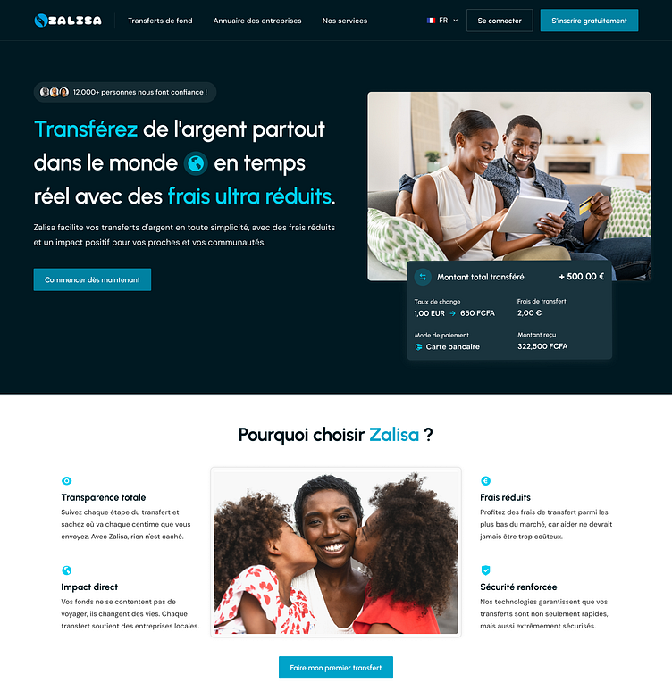
Here’s a glimpse of the landing page I designed for Zalisa, a platform making global money transfers simple, fast, and affordable.
💡 Key features:
1. Clear and impactful hero section with key CTAs for instant action.
2. Transparent transfer details to build trust with users.
3. A 'Why Choose Us' section to highlight benefits like low fees, security, and impact-driven transfers.
The goal was to create a user-friendly, visually appealing design that simplifies the process and builds confidence for users making international transfers.
💻 More work
✨ Open to new projects
More by Maxime BREVET View profile
Like
