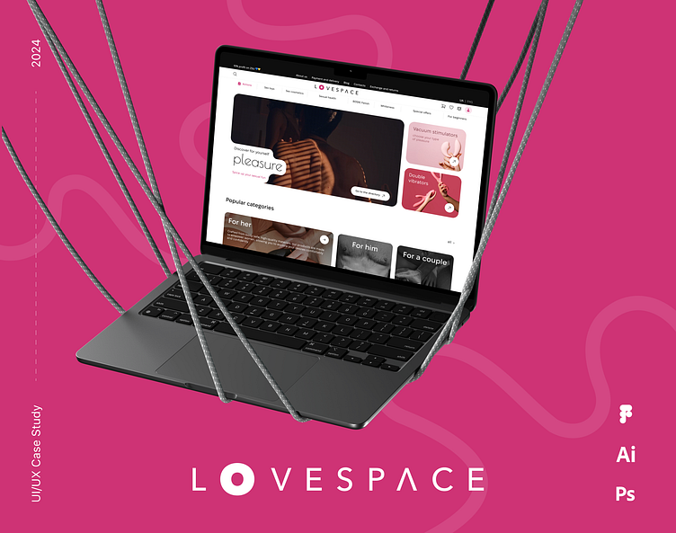
Lovespace - The space of sexual knowledge
About Project
The goal is to redesign Lovespace, an e-commerce sex shop, to improve its overall user experience, interface design, brand appeal, and functionality, driving better user engagement and conversion rates.
The biggest sex-shop for your pleasurable desires
The challenge is to create a seamless user experience that prioritizes both functionality and discretion. From sleek product pages and intuitive navigation to mobile-first design and strong visual identity
Colors & Typography
The color palette is bright and corresponds to the brand book.
UI KIT
These kits streamline the design process by providing a standardized set of components, such as buttons, forms, icons, navigation bars, and more, ensuring consistency and efficiency across projects.
Main Page & Catalog
A convenient main page that includes popular categories, new products, reviews of products, as well as useful links to articles.The catalog has convenient filters that facilitate the search.
Product Card
Product card containing all the necessary information was also developed. There is detailed information about the product and its characteristics, information about terms and methods of delivery, a video review of the product. And also the opportunity to ask questions or leave feedback.
Checkout
Checkout with all the details for convenient, stress-free ordering
Improve product discovery with better categorization and personalized recommendations. Simplify the checkout process to reduce friction, and create a refined, inclusive brand identity to attract a wider audience.


