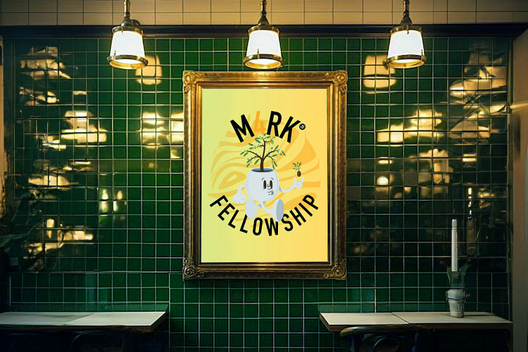
Classic logo and logomark for a youth group
A meaningful approach to designing a logo and identity for a local youth group aimed at providing services for teenagers in need. Creation of a logo and basic branding & aesthetics for a youth group that takes its meaning and representation from a bible verse.
The brief was to create an early 1900s cartoon style character that can be used as part of the logo and branding that incorporates the name "M4RK Fellowship" and the passage number 4:20, into the theme.
The passage itself, talks to growing a seed in good ground and seeing the fruit of your good labour, which has been taken into the character that itself is a grown healthy olive tree, that is on it's way to plan a healthy seed. "But these are the ones sown on good ground, those who hear the word, accept it, and bear fruit: some thirty fold, some sixty, and some a hundred".
After a bit of back and forth with the client to ensure the style of the cartoon element of the logo, the seed/branches, and the colours used, the final concept was eagerly accepted and used to represent the team. The colours were purposefully chosen to represent dawn and dusk in the yellows and oranges, alongside earthy calmness in the greens - all natural colours to reflect life.


