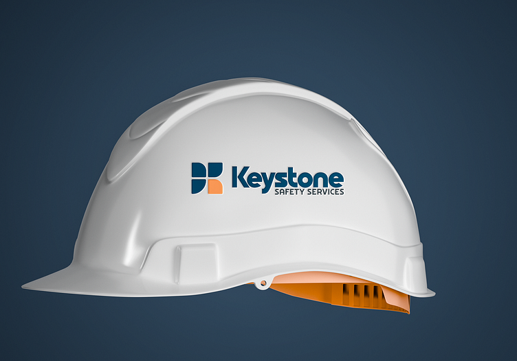
Logo for Construction Safety Service Startup
New brand identity for Keystone Safety Services, an Environmental Health & Safety (EHS) consultancy serving New York's Capital Region. The challenge was to create a brand that conveys both trustworthiness and innovation in the safety services sector.
The logo mark is built from rounded geometric shapes forming an abstract "K" while also representing a keystone – the crucial element that holds an arch together, symbolizing the company's role in maintaining workplace safety.
The color palette combines deep navy for authority and trust with warm coral accents that add approachability and modernity to an traditionally conservative industry. The minimalist typography is intentionally bold and clear, reflecting the company's straightforward approach to safety solutions.
