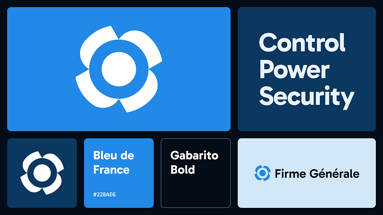
Business Management App Brand Identity
Introduction
At the beginning of November, a client approached me requesting to design a website for their new SaaS product. Since they didn’t have a brand identity, the first step was establishing a visual style for the software before moving on to the website design.
About Firme Générale
Firme Générale is an app designed for small and medium-sized businesses, providing complete control over employees, tasks, projects, and all aspects of business management. It aims to serve as a unified platform, eliminating the need for multiple app integrations.
Logomark
My design process begins with creating a logomark that reflects the client's mission in a clear and stable format, aligning with the modern, minimalist aesthetic that is standard in the industry. The logomark features a central circle symbolizing the "core." of the organization, representing total control. Surrounding it is a motor propeller, embodying the concepts of power and stability, seamlessly driving the core.
A logomark doesn't need to explain itself since its purpose is to identify, but having a story behind it is a great way to market company goals and align identity to them, so users can remember that when deciding which software to use.
Brand elements
The primary color is a vibrant, modern shade of blue, positioning the brand strongly within its industry. Its high saturation conveys energy, trust, innovation, and professionalism—qualities often linked to technology and business.
Gabarito is a clean, modern sans-serif font with sharp edges and balanced proportions, offering excellent clarity and readability for both display and body text.
Conclusion
For Firme Générale, I created a visual identity centered on clarity and purpose. From the core-inspired logomark to the bold blue palette and modern typography, each element aligns with the brand’s mission of seamless business management.
