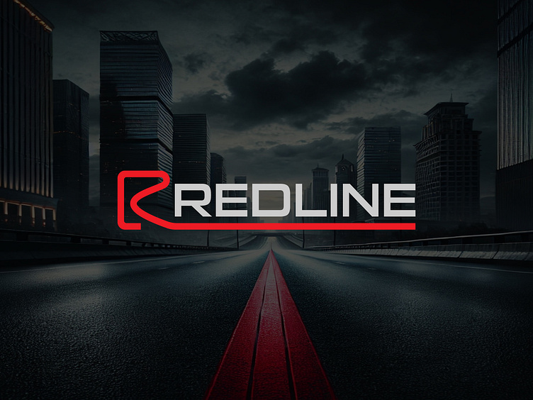
REDLINE Logo Design: Minimal, Modern, and Versatile Branding
The Art Behind REDLINE: Concept, Design, and Purpose
The REDLINE logo embodies a minimalistic, modern design with a seamless integration of the letters "R" and "L," connected by a dynamic red line. Its bold typography represents energy, stability, and confidence, while the red, gray, and black palette enhances its bold and professional appeal.
Key Features
Dynamic Shape: The "R" flows into the underline forming the "L," creating visual harmony.
Versatility: Perfect for digital and print applications, from business cards to banners.
What the Logo Represents
Letter R: Reflects movement, innovation, and energy.
Letter L: Represents stability and reliability.
Line: Embodies speed, precision, and action, perfectly echoing the "REDLINE" name.
Contact for Custom Logo Designs
📧 Email: contact@naieem.com
📱 WhatsApp: +8801789108921
Visit my Fiverr profile to explore my work and see client reviews for trusted, quality logo design
🔗Fiverr profile : Naieem
Follow us on Instagram - Linkedin
All Rights Reserved © naieem.com


