Minimalist E-Commerce Website - UI Case Study
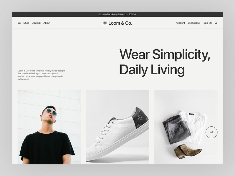
Presenting a comprehensive design project for Loom & Co., a newly conceptualized e-commerce platform for modern lifestyle brands. This end-to-end UI/UX project focuses on delivering a seamless shopping experience through clean aesthetics and intuitive navigation.
Key features include:
Homepage: Engaging hero section, category highlights, and promotional banners.
Product Listing: Organized grid layout with filtering and sorting options.
Product Detail Page: Interactive design with size guides, color swatches, and CTAs.
Checkout Flow: Streamlined process to reduce friction and boost conversions.
This project emphasizes modern minimalism, responsive design, and user-centric functionality, creating a visually stunning and efficient platform for online shoppers.
Shop Grid View
Product Detail Page
Full Version Homepage
Think this design is cool?
Press 'L' or leave a ❤️ if you like it, and feel free to share your feedback in the comments below. Thanks for stopping by—have a great day! ✌️
Got a project idea? I'm open to new projects! 📧
Reach out at ahmedriyad338@gmail.com


