Aqbobek School Rebranding
About the project
Aqbobek is a well-established children's educational center in Aktobe, with a proud history of fostering the development and education of children aged 3 to 15. The center’s mission is to create an engaging and secure learning environment where every child can reach their full potential and gain the knowledge, skills, and experiences needed for a successful life.
The target audience for this rebranding project are parents aged 20 to 60, with a focus on those who are financially stable and have an open-minded approach to the world.
My goal was to lead the rebranding effort by updating the identity of Аqbobek, making the project memorable while preserving its core values. The original logo features an image of a boy and colorful letters, elements which I aim to retain. The challenge is to create a fresh, minimalistic design that still feels playful and appropriate for a children's educational center.
New Logo
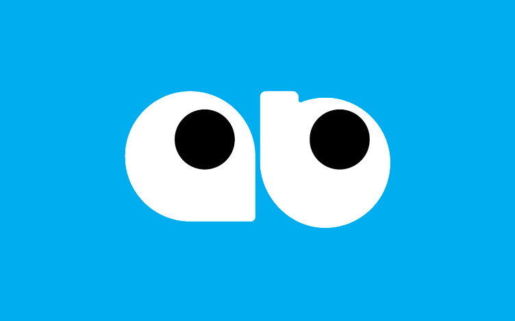
The proposed logo concept consists of a graphic and a typographic part. The graphic logo features the letters a and b designed to resemble children's eyes. This effect is achieved through creative shaping: the letters are based on simple white circles, with their inner holes stylized as black pupils looking toward the upper right corner, symbolizing growth. This approach preserves the childlike essence of the company's previous logo while making it more modern, minimalist, and therefore, more memorable.
A key aspect of the logo is its rounded design, which conveys a sense of safety and softness. This idea is further reflected in the choice of typography. It is recommended to use the Nunito typeface family to complement the logo's visual style.


