ZenBrew: A Bold Refreshment Experience
Design Process:
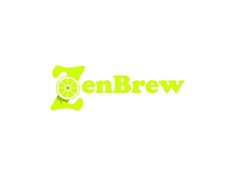
Concept Ideation: The inspiration behind ZenBrew stemmed from the idea of combining energy and serenity—a drink that rejuvenates yet soothes. The lime slice dripping zest into the "Z" in the logo symbolizes vitality, freshness, and mindfulness.
Typography: The typeface Cooper Black was chosen for its bold yet playful appeal, reinforcing the brand's modern and approachable personality.
Color Palette: The vibrant lime green (#CEFF0D) serves as the primary color, symbolizing zest and health, while the deep green (#213501) grounds the brand in nature and authenticity.t here...
Visual Applications:
Coasters: Minimalistic white designs with pops of green for a clean, fresh aesthetic.
Bottles: Black textured labels with a splash of lime green give a premium, modern feel while ensuring strong shelf presence.
Social Media Assets: Designed visuals to extend brand storytelling on digital platforms, engaging the audience with ZenBrew's refreshing vibe.
Packaging Concept: Focused on eco-friendly materials to align with the brand's commitment to sustainability while ensuring the design exudes sophistication and vibrancy.
Logo Design: A citrus-infused “Z” reflects the core values of freshness and balance.
Color Strategy: Contrasting greens create an energetic yet soothing visual appeal.
Brand Personality: Bold, innovative, approachable, and eco-conscious.
Project Goals:
The goal of the ZenBrew project was to craft a brand that feels alive yet peaceful, resonating with audiences who value health, mindfulness, and design-driven lifestyles.
Outcome:
ZenBrew’s visual identity successfully bridges modern aesthetics and natural elements, making it not just a beverage brand but a design story that inspires.


