Paz Funding Source: A Website Designed for Growth🌟
In my recent project, I worked on designing a website for a strategic funding platform that aims to empower businesses with financial solutions tailored to their needs. The goal was to craft a visually compelling and highly functional interface that resonates with professionalism and trustworthiness while keeping a modern edge. 😊
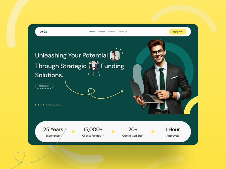
The hero section was a significant focus. I explored various layout options to balance the vibrant yellow and green color palette, emphasizing energy and growth. The bold headline, key statistics, and a confident professional image all came together to communicate reliability and expertise. This design sets the stage for a memorable user journey while driving engagement. 💛
To build trust and highlight the platform's credibility, I designed a section dedicated to showcasing its partners and collaborative values 🤝✨. Circular image elements were introduced to convey connection and human interaction, while trusted partner logos reinforced reliability and industry authority 💼🌟.
The bold and approachable call-to-action, 'Looking for Business Funding?' ensures users are guided seamlessly toward conversion 🚀. Every detail was thoughtfully crafted to align with the platform’s forward-thinking ethos 🫶💡.
To further enhance user experience, I included a detailed FAQ section designed to address common questions clearly and concisely ❓📚. The questions and answers are presented in a user-friendly format, helping users feel informed and confident as they explore funding options. This section strengthens transparency and builds trust, making the funding process approachable and stress-free 🌟✨.
Design of this website emphasizes accessibility and user engagement, highlighting the platform’s mission to support businesses effectively 🌟.
Circular visuals create a sense of collaboration and connection 🤝, while the vibrant layout blends professional elegance with energy 🌱. Trusted partner logos reinforce credibility, showcasing the platform’s proven expertise and reliability. The seamless design ensures users feel supported, inspired, and ready to take the next step toward their business growth 🚀✨.
This project represents a clean, professional, and user-focused design for a strategic funding platform 🌟. The use of bold typography, vibrant colors, and fluid layouts conveys a sense of trust, innovation, and energy. By combining modern visuals with approachable elements, the design ensures users feel confident and connected throughout their journey 💼✨.
The vibrant green and yellow palette, complemented by dynamic abstract shapes, symbolizes growth and forward motion 🌱. Carefully chosen imagery and typography work together to create a relatable, aspirational tone, perfectly aligning with the platform’s mission to empower businesses 🚀. Every detail reflects thoughtful design and a commitment to excellence, offering users an engaging and seamless experience 🌟.
Let’s craft your next digital masterpiece together.


