MARY NAILS SPA | LOGO DESIGN & BRAND IDENTITY
The Mary Nails Spa brand was born with the mission of bringing customers comprehensive, professional and relaxing beauty experiences. creating moments of relaxation and confidence through each meticulously and creatively designed set of nails. Mary Nails Spa aims to become the ideal companion on your journey to perfect your beauty.
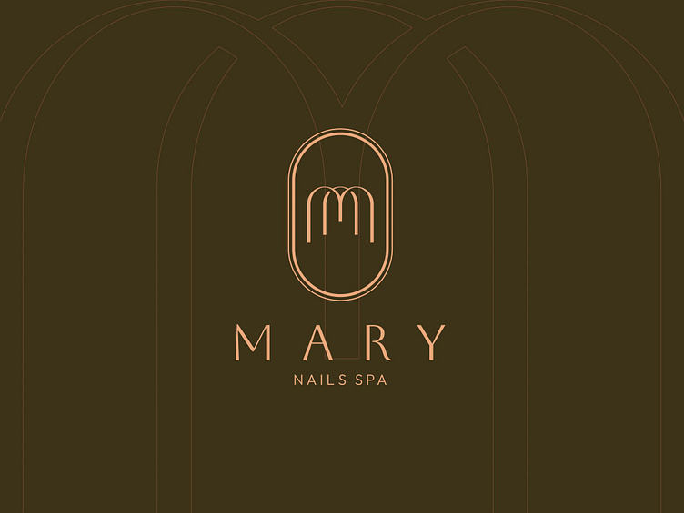
The Mary Nails spa brand identity designed by Bee Art uses two main color tones: moss green and beige orange, expressing sophistication, closeness and modernity. Moss green brings a feeling of relaxation and nature, while beige orange creates warmth, femininity and luxury. This combination not only reflects the core values of Mary Nails Spa but also creates a professional, friendly impression, suitable for customers who love harmonious and sophisticated beauty.
The Mary Nails spa brand logo is designed with a stylized M letter made of gentle, curvy lines, representing the brand name. These curves not only evoke the image of nails but also bring a soft, elegant feeling. The design is not too complicated but still shows luxury, professionalism and high-class.
Designed by Bee Art
-
Client Mary Nails Spa
Logo and Branding Project. Logo is design for Restaurant in USA.
Copyright© Bee Art. All Right Reserved
Contact us:
• Hotline/ Zalo: (+84) 77 34567 18
• Email: info@beeart.vn
• Website: www.beeart.vn
• Facebook: https://www.facebook.com/BeeArt.vn


