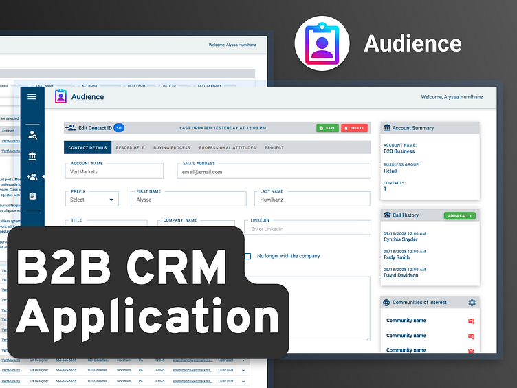
Audience B2B Application UI
The Problem
I was asked to redesign a CRM web app, my client asked me reskin it and solve accessibility issues and inefficient workflows. The primary persona was marketing managers. The main complaint by users was they had trouble in critical workflows of tracking leads, logging calls, and updating contact info. The old app felt "clunky". The main issues we solved for were:
Fix Accessibility Issues: Make the app fully WCAG 2.1 compliant, improving navigation for users with disabilities (keyboard shortcuts, screen reader support, better color contrast).
Simplify Key Workflows: Streamline tasks like reviewing reader data, logging calls, adding contacts, and managing leads so users can complete them faster and with less effort.
Code Cleanup: Developers on this project were tasked with aligning the core functionality with a new look and feel, using a UI library called Vuetify.
2 Sprints to build: This design was expected to launch in a very short timeframe. I partnered with developers throughout the design process for handoffs as screens were ready. We used Dan Mall's "Hot Potato" workflow.
The result
The new design improved workflow efficiency and impressed users.


