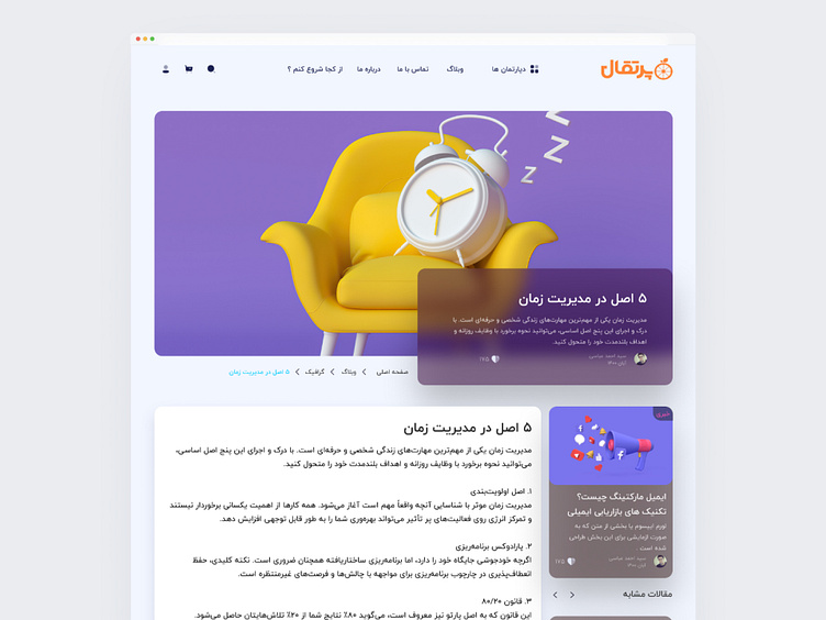
Blog Single Page
✨ Blog Single Page with Glassmorphic Elegance
Excited to share my take on a modern blog reading experience! This single post page design embraces glassmorphism to create an immersive yet comfortable reading environment.
The design features floating glass panels that house the content, creating subtle depth and hierarchy. I focused on typography and white space to ensure optimal readability while maintaining the ethereal glass aesthetic. The frosted glass effect adds a premium feel without compromising the content's clarity.
Key features:
Floating glass cards for content sections
Enhanced reading experience with proper spacing
Light blur effects for depth
Responsive layout
Clean typography hierarchy
Tools: Figma
Style: Glassmorphism
Type: Blog Single Page
What's your take on using glassmorphism for long-form content? Does it enhance or distract from the reading experience?
#UIDesign #Glassmorphism #BlogDesign #UserInterface #WebDesign #Dribbble #MinimalDesign #Typography #ContentFirst #ModernUI"
