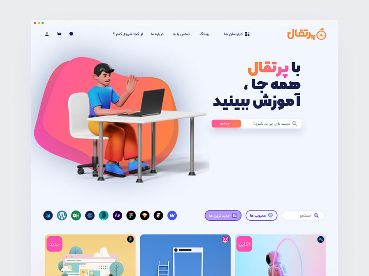
Educational Landing Page | Glassmorphic Design
🍊 Introducing a fresh take - Landing page design for Portaghal Educational Group with a glassmorphic twist!
The core concept revolves around blending transparency and depth with educational elements. I utilized soft blur effects and translucent layers to create dimension, perfectly complementing Portaghal's vibrant and dynamic brand identity.
A warm, inviting color palette combined with modern typography and minimal visual elements creates an engaging space that welcomes users to explore and learn.
What are your thoughts on using glassmorphism in educational designs?
Let me know in the comments!
Tools: Figma
Style: Glassmorphism
Project Type: Educational Landing Page
#UI #UX #Glassmorphism #EducationalDesign #UserInterface #WebDesign #Dribbble #DesignCommunity #MinimalDesign #LandingPage
More by Ahmad Abbasi View profile
Like
