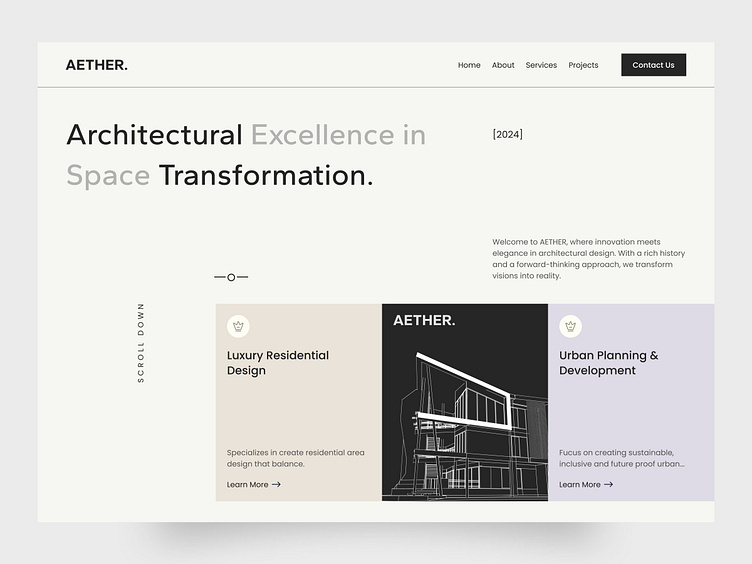
AETHER _ Architecture Website Landing Page Design.
The design highlights:
I'm excited to share a new UI design concept created for an architecture firm. The design aims to blend form and function, offering a visually striking interface that elevates the user experience. Key features include:
🎨Minimalist Design: Clean lines and a refined aesthetic to let the architectural projects take center stage.
💡Seamless User Experience: Intuitive navigation to ensure easy access to portfolios, services, and contact information.
Typography & Color
In this project, I’ve carefully selected typography and color to reflect the essence of modern architecture while ensuring readability and aesthetic appeal.
Typography: The typeface is sleek and modern, chosen to mirror the precision and sophistication of architectural designs. I’ve utilized a combination of serif fonts for headings to convey elegance and professionalism, and sans-serif fonts for body text to ensure clarity and simplicity in reading.
Color Palette: The color scheme draws inspiration from neutral tones often seen in architectural materials, such as stone greys, muted whites, and soft earthy hues. These tones provide a minimalist backdrop, allowing the visual content (projects, images) to stand out.


