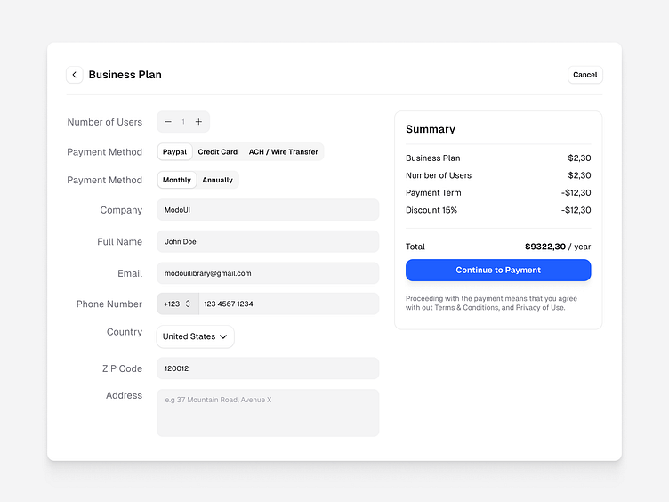
Payment modal exploration - Light & Dark Mode
Payment modals help users complete transactions quickly and confidently. By presenting all necessary details—like payment methods, billing info, and totals—modals ensure a frictionless experience. Including a light and dark mode makes the design accessible and visually cohesive across different user preferences or app themes.
Modals should be clear, distraction-free, and accessible, guiding the user to their goal without feeling cluttered or overwhelming.
More by Jetmir Haxhiavdyli View profile
Like

