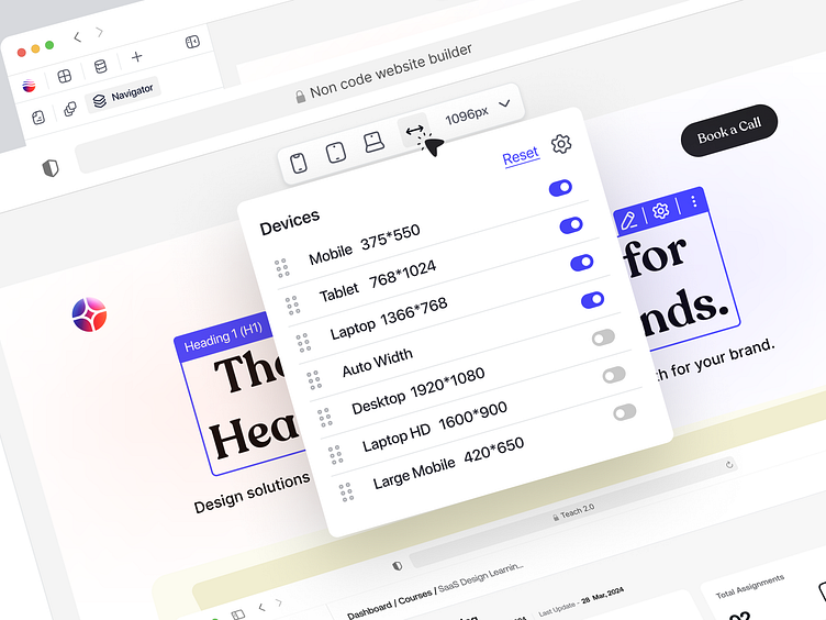
Website Builder Dimension
About this Dimension widget
This dimension widget appears to be from a responsive design testing tool, commonly found in design software or browser development tools.
Purpose
The popup is used to switch between different device screen sizes and resolutions for testing the responsiveness and appearance of a webpage or design across various devices.
Use Case of this Dimension
This popup is part of a responsive design workflow, enabling designers and developers to:
1. Preview how a website or app appears on different devices.
2. Test layouts for usability and visual consistency.
3. Detect and fix any responsive issues before deployment.
Thanks for checking it out!
If you're looking for a design partner for your next SaaS project, drop me a line, and let's talk about how I can help you achieve your goals.
If you find this design appealing, don't hesitate to leave a like 👍
----------------------------------------------------------------------------------------------------
muradjm3@gmail.com
WhatsApp: https://wa.link/oiciqh

