Stunning Hero Section Design for Travel & Accommodation Booking
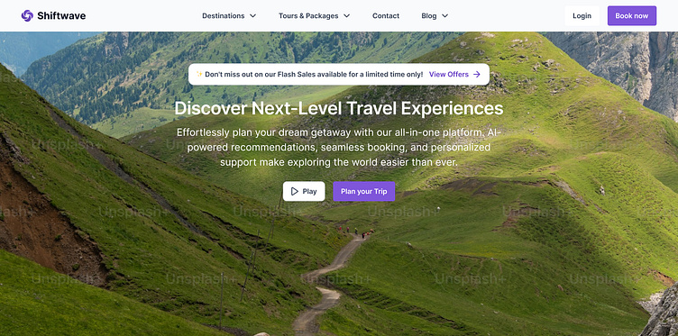
The design in this image showcases a professional and visually appealing hero section tailored for a travel or tourism-focused website. Here's a detailed breakdown:
1. Navigation Bar:
- Positioned at the top, the navigation bar includes categories like Destinations, Tours & Packages, Contact, and Blog, which provide users with easy access to essential sections of the site.
- Clear Login and Book Now buttons are placed on the top-right corner, with the Book Now button styled in vibrant purple to grab attention.
2. Key Visual and Background:
- The background features a breathtaking landscape of lush green hills under a bright sky, evoking a sense of adventure and tranquility. The natural scenery aligns perfectly with the travel theme, inspiring users to imagine their next journey.
- The image is overlaid subtly to maintain text readability while preserving the vibrancy of the visuals.
3. Heading and Subheading:
- The heading, "Discover Next-Level Travel Experiences", is prominently displayed in a clean sans-serif font with a bold style to grab attention.
- The subheading provides more context: "Effortlessly plan your dream getaway with our all-in-one platform. AI-powered recommendations, seamless booking, and personalized support make exploring the world easier than ever." This concise and inviting description highlights the platform's core benefits.
4. Flash Sales Banner:
- A smaller banner at the top of the section reads: "✨ Don't miss out on our Flash Sales available for a limited time only! View Offers ➜", styled in a white pill-shaped box with a purple accent for the CTA. This creates a sense of urgency and encourages immediate action.
5. Call-to-Action Buttons:
- Two action buttons are strategically placed below the text:
- Play (likely to showcase a video or demo) is styled in a simple white outline button.
- Plan your Trip is highlighted in purple, making it the primary CTA and visually distinct to encourage user interaction.
Overall Design Aesthetic:
- The layout adopts a modern, clean, and user-centric approach, blending vivid imagery with intuitive navigation.
- The color scheme (green from the landscape, purple accents, and white text) is harmonious and aligns with the theme of exploration and convenience.
- The design is structured to balance aesthetic appeal with functionality, ensuring users are visually engaged while finding essential information quickly.
This design effectively conveys professionalism while evoking inspiration for travel, making it highly appealing for a travel-related platform.
You can access the design for free here
I'm Guru Nivash R, aspiring Product Designer who's passionate about creating user-friendly and scalable digital solutions. Feel free to connect with me on LinkedIn or email me at guru532000@gmail.com for any queries or collaboration
