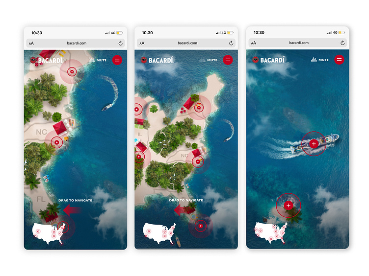
Casa Bacardi Festival Map
Project Overview
Working on projects for BACARDÍ has been a unique experience. As a designer, I've had the privilege of collaborating with a brand that's not only iconic but also deeply rooted in culture and innovation.
BACARDÍ North America sought to develop an engaging interactive landing page emphasizing their festival activations and cocktails, with a focus on driving traffic to their e-commerce website.
Design
The landing page blends a bold, tropical aesthetic with intuitive navigation, embodying BACARDÍ’s lively and adventurous spirit. The user experience is crafted to spark curiosity, drive engagement, and convert interest into action, creating a seamless bridge between brand storytelling and e-commerce.
Key Features
Dynamic Entry Points: Users access the landing page through various channels, including social media, email campaigns, online advertisements, QR codes, and the main BACARDÍ website, ensuring a wide and diverse audience reach.
Age Gate Compliance: Upon entry, users pass through an elegantly designed age verification screen, adhering to industry standards while maintaining the brand's premium aesthetic.
Welcome Experience: A warm, visually engaging welcome message sets the tone, inviting users to embark on an interactive journey through the BACARDÍ Island.
Cocktail Showcase: A dedicated section highlights BACARDÍ's signature cocktails, brought to life with vibrant imagery, detailed recipes, and information on unique ingredients. This feature inspires users to recreate the BACARDÍ experience at home while celebrating the art of mixology.
Strategic Call-to-Actions: Thoughtfully placed CTAs guide users effortlessly to the e-commerce site, encouraging them to explore and purchase BACARDÍ products or take advantage of limited-time offers.


