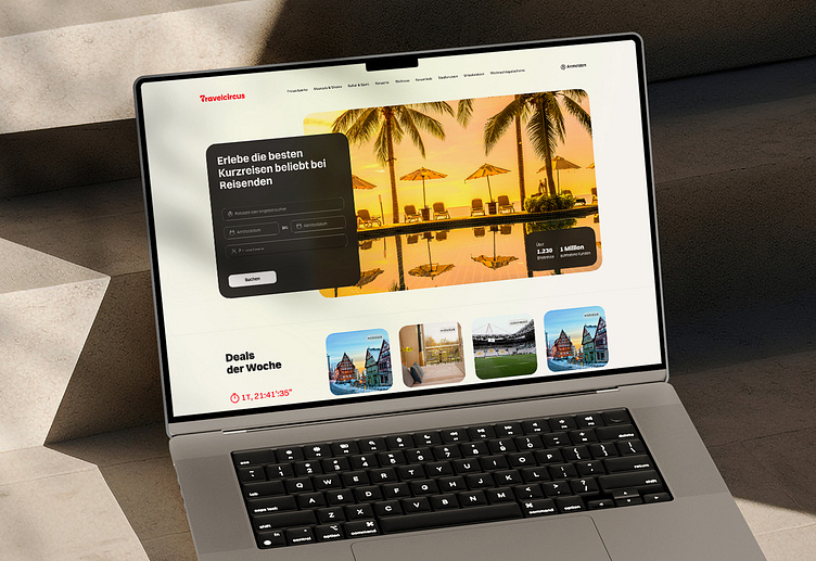
Travelcircus Redesign: A Minimal & User-Focused Approach
Here’s my concept redesign for Travelcircus.de, a platform for offering special travel experiences. My focus was to streamline the user journey by removing redundant sections, simplifying the interface, and directing attention toward the main goal: booking unforgettable trips.
This updated design aligns with modern aesthetics by adopting a minimal, clean style, making it easier for users to navigate and engage with the platform.
To create a seamless, visually stunning experience that captures the thrill of travel planning.
Full Page
Styles
More by Mohamad Salari View profile
Like


