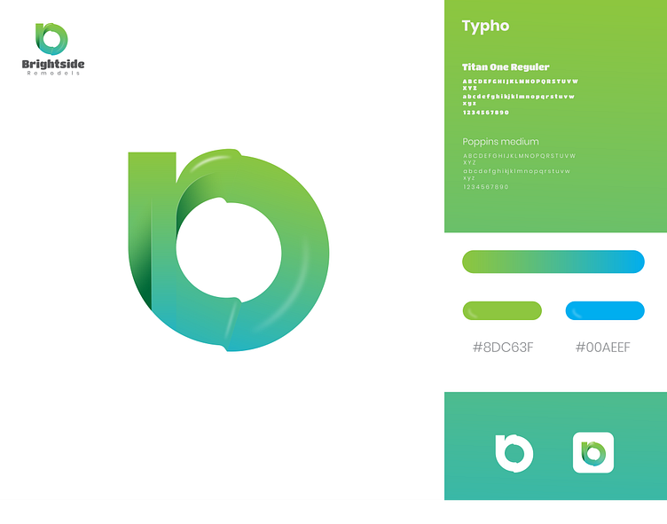
Brightside remodels modern logo design
Project Title: Brightside Remodels Logo Design
Overview: The logo design for Brightside Remodels is a sophisticated and modern representation of the company's brand identity. The logo combines the letters "b" and "r" into a single, cohesive symbol, reflecting the company's innovative approach to remodeling and renovation services.
Design Concept: The primary goal was to create a logo that is both elegant and memorable. The combination of the letters "b" and "r" forms a unique and abstract shape, symbolizing the seamless integration of the company's services. The gradient color transition from green to blue adds a dynamic and modern touch, representing growth, renewal, and trust.
Typography:
Primary Font: Titan One Regular
Numbers: 1234567890
Secondary Font: Poppins Medium
Color Palette:
Green: #8DC63F
Blue: #00AEEF
Logo Variations:
Primary Logo: A standalone symbol combining the letters "b" and "r" with a gradient color transition.
Secondary Logo: The primary logo within a rounded square, providing versatility for different applications.
Usage: The logo is designed to be versatile and adaptable, suitable for various applications such as business cards, websites, social media, and promotional materials. The clean and modern design ensures that the logo remains impactful and recognizable across different platforms.
Conclusion: The Brightside Remodels logo successfully captures the essence of the brand, combining elegance, modernity, and innovation. The unique integration of the letters "b" and "r" creates a memorable and distinctive visual identity that sets the company apart in the remodeling industry.


