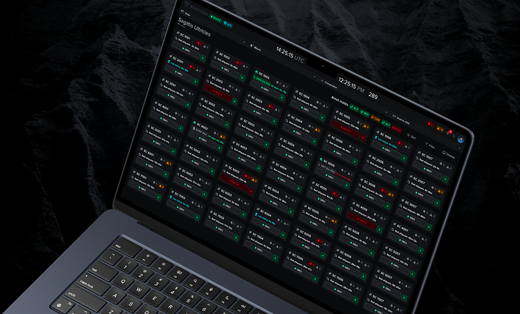
Case Study: Constellation Status
Problem: Current platform doesn't support the monitoring of more than one space vehicle at a time. With upcoming missions that need to support larger constellations of satellites in became imperative that operators had the ability to monitor several space vehicles at one time.
Solution: A new Operations view that not only supports the ability to monitor more than one spacecraft at a time but also creates a simpler and much more consistent user experience.
User Testing
I conducted user testing to validate the designs I had come up with to see how our constellation status designs would be received by the end-users.
Below is the script I used for conducting the interviews. Using a script ensures that you ask each participant the same questions which in return helps to see patterns in your participants feedback.
I met with seven different participants and conducted 1 on 1 interviews and received permission to record each participant so that I could go back over the recordings later for my notes.
Helpful Tip: Whatever meeting software you use, check to see if it has the ability to transcribe the recording. If I'm conducting the user testing sessions myself, I'm not very good at taking notes so I found this feature super helpful so I could go over the transcriptions later for my notes.
Affinity Diagram
After we wrapped up our design validation sessions I put together an affinity diagram to capture and organize all the feedback. I find affinity diagrams a great way to process the feedback and lay it out in a way that's easy to digest for myself and others.
We walked through the feedback with the product manager, SME's and other stakeholders and talked about our findings and recommendations.
Key Takeaways
Some of the key takeaways from our user testing was the overall the design provided a nice quick high-level view of the constellation's status and shows what needs attention.
A couple participants felt like it was a little busy but could get used to it after using it for some time.
A few participants were confused about some of the time indicators displayed on the vehicle cards but did indicate displaying the time information was helpful.
We had feedback about some smaller elements like how the sorting and filtering should work, what information should be displayed on the popover when clicking on the vehicle cards and how it would be nice to save favorite vehicles.
Some quotes from the participants we received:
“This is supercool, gonna be super useful to have”
"I like the way it looks, it's not in your face, but it tells you what you need."
"Good work, looks awesome"
"It's definitely going to help in organizing a lot of vehicles."


