Let’s Travel - Travel App Concept
Let’s Travel - Travel App Concept
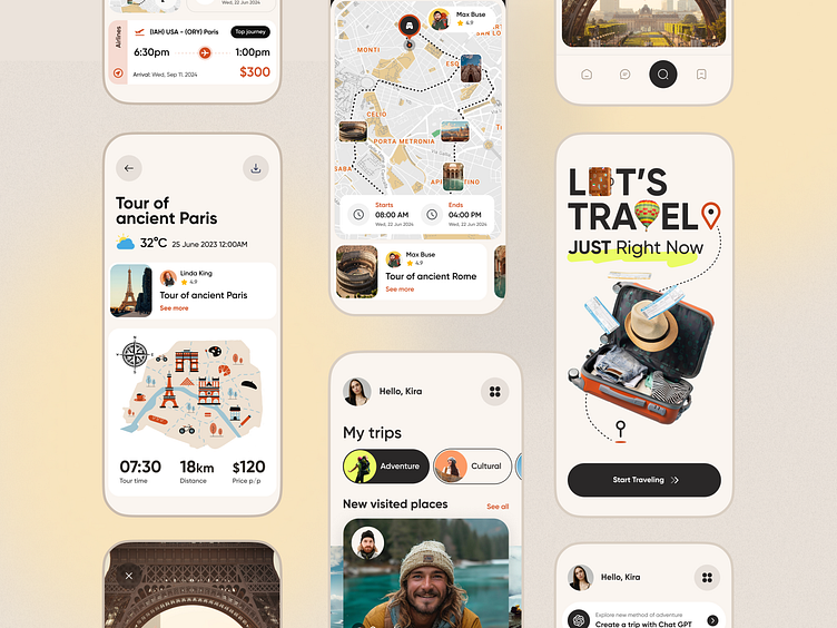
Let’s Travel is a conceptual design for a travel app focused on seamless navigation and user-friendly interfaces. The app aims to make the travel planning experience straightforward and enjoyable by emphasizing clarity and accessibility in every feature.
1. Detailed Tour Information: Each tour screen provides essential details, including start and end times, distances, weather forecasts, and pricing. The design maintains a balance between visual appeal and readability, ensuring that users can easily access the information they need.
2. Interactive Map View: The map interface is designed to enhance the user’s spatial understanding of their destination. With key landmarks and points of interest clearly marked, the map helps users visualize their routes and explore the area with confidence.
3. Personalized Dashboard: The user’s dashboard presents a summary of planned trips, recently visited places, and recommendations tailored to their travel history. The layout is structured to keep essential information within reach, while the use of white space adds a clean, organized feel.
4. Engaging Splash Screen: The introductory screen sets an adventurous tone with a simple call to action, “Let’s Travel – Just Right Now!” Paired with travel-themed visuals, this element is designed to immediately engage users and prompt them to start exploring.
This concept showcases a minimalist aesthetic with a focus on practical functionality. Each element is designed to support an intuitive, efficient travel planning experience, appealing to users who value both style and substance in their digital tools.
Do you want to create something great? Feel free to contact us - anastasia@tino.design
