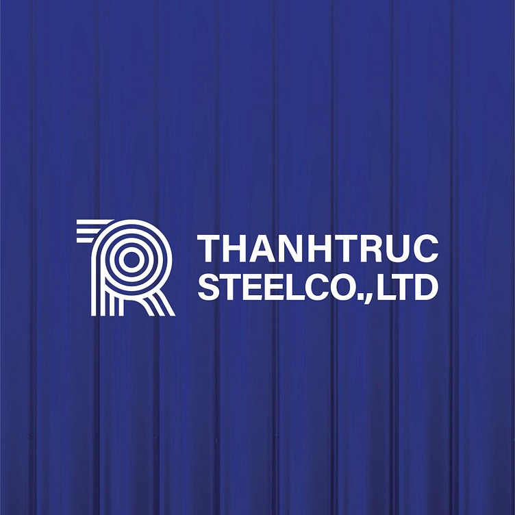
THANHTRUC STEELCO.,LTD | LOGO DESIGN & BRAND IDENTITY
Thanh Truc Steel Production and Processing Factory was established with the mission of providing high quality products and meeting the diverse needs of the market. Thanh Truc always puts the interests of customers first, constantly improving to become a reliable and sustainable partner in the steel industry.
The Thanh Truc steel brand identity designed by Bee Art uses two main colors, blue and white, to show professionalism, prestige and sustainability in the field of steel production and processing. This combination not only brings a sense of trust but also conveys a strong and modern image, in line with Thanh Truc's mission of serving high-quality products.
Thanh Truc's logo is delicately designed, stylizing the letters T and R in the brand name with straight and curved lines. This combination not only brings a feeling of solidity and strength but is still flexible, completely suitable for the necessary properties of a steel bar. The overall logo helps to show the professionalism, prestige as well as product quality of the brand.
-
Client Thanhtruc SteelCO.,LTD
Logo Design Project. Logo is designed for Steel production and processing.
Copyright© Bee Art. All Right Reserved
Contact us:
• Hotline/ Zalo: (+84) 77 34567 18
• Email: info@beeart.vn
• Website: www.beeart.vn
• Facebook: https://www.facebook.com/BeeArt.vn


