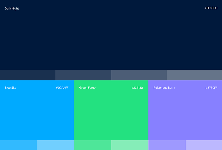
Hutte | Color Palette
Hutte reshapes the way developers experience Salesforce.
For us, Hutte—the German word for "Hut"—became more than just a translation. It became a story. A symbol of warmth and rest, perfectly nestled within Salesforce's trailhead. We set out to design a brand identity that mirrors this concept. But how did this journey unfold? And how does it tie into the Trailhead experience?
Read the full story behind the brand that welcomes you in, when you need a rest from the hike: https://www.konpo.studio/work/hutte
More by Konpo View profile
Like
