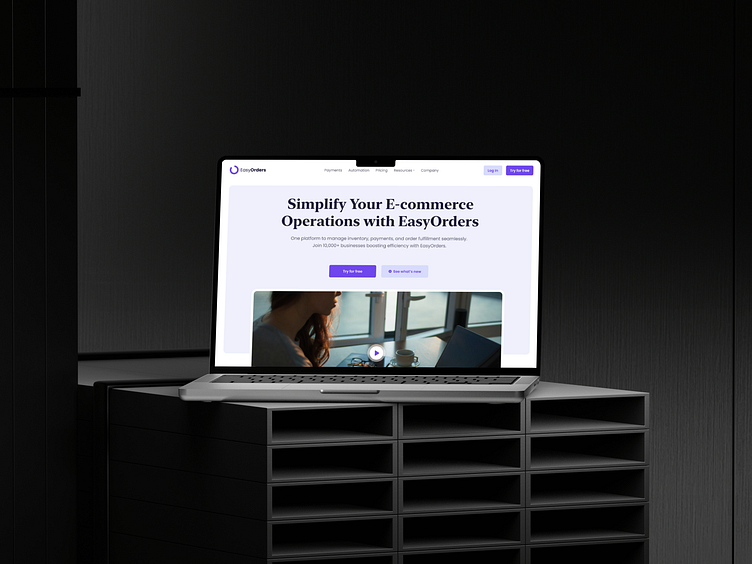
Design & Web Development | Saas Landing page
Project Objective
The goal of the project was to create a visually appealing and user-friendly landing page for EasyOrders, a SaaS platform designed to simplify e-commerce transactions. The main tasks included: - To explain the main features of the platform (automation, payments, analytics). - Building trust through customer testimonials and logos. - Encouraging users to interact through clear calls to action such as ‘Try it for free’.
My solution
As the UX/UI designer and developer, I delivered:
1. User-Centered Design:
- Designed a clean, modern layout with intuitive navigation for seamless user interaction.
- Applied a consistent color palette (soft purples and white) to convey professionalism and trust.
2. Strategic Content Structure:
- Placed an engaging hero section with a clear headline, supporting video, and CTAs to grab immediate attention.
- Created sections to highlight key features, client testimonials, and brand partnerships to communicate value effectively.
3.Development Execution:
- Developed a fully responsive landing page, ensuring an optimal experience across devices.
- Integrated interactive elements such as buttons and cards to enhance engagement.
Results
- Improved user engagement: The streamlined design and strategic CTAs boosted trial sign-ups.
- Enhanced credibility: Trust elements like testimonials and partner logos helped build user confidence.
- Scalable impact: A responsive design ensured consistent performance on all devices, expanding the platform’s audience reach.

