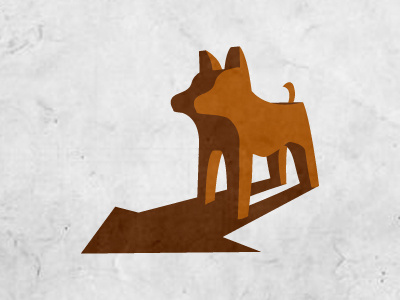
Animal Shelter Logo - Rebound
Ok. totally different direction. losing the "cute" feeling, felt it was too cute and a bit too cartoonish. I don't like that. and it didn't fit with my case. Went on playing around with the concept and dropped the concept of "running over an arrow" it didn't connect. Right now there is a 2 colored piece, dark and light.
The darkness in the dogs' shape stands for the past. (Most of these animals have been treated poorly to say the least) And opposed to it's "body"darkness there's a shadow pointing forward/in the shape of a house... the light side gives a fresher feel and makes the icon take more shape.
Let me know. Looking forward to how you feel about this. haven't put the font next to it yet cause i can't publish the clients name yet.
More by Richard de Ruijter View profile
Like
