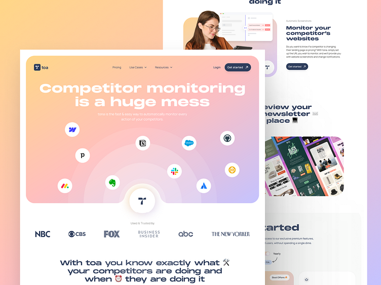
TOA – A Sleek Landing Page for Competitor Activity Track
✻ Hey All👋
Here’s my latest project for TOA - Landing Page for Competitor Monitoring.
Take a look at this landing page designed for Competitor Activity Tracking. The focus was on creating a sleek, intuitive and user friendly layout that makes it easy for users to stay updated on industry movements and make informed decisions.
🚀 Step into my Dribbble world!
I design digital products with a focus on UX/UI. I love turning concepts into immersive visual experiences. I create websites and apps that don’t just look great, they’re crafted for high performance and an effortless user experience.
😊 Did you enjoy it?
If you liked what you saw, let’s collaborate and take your project to the next level.
💬 Contact me today at:
📫 studiolauragrognetti@gmail.com
More by Laura Grognetti View profile
Services by Laura Grognetti
Like


