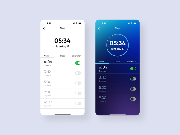
Alarm clock app ui
⏰ 𝗘𝘅𝗽𝗹𝗼𝗿𝗶𝗻𝗴 𝗧𝘄𝗼 𝗦𝘁𝘆𝗹𝗲𝘀 𝗳𝗼𝗿 𝗮𝗻 𝗔𝗹𝗮𝗿𝗺 𝗖𝗹𝗼𝗰𝗸 𝗔𝗽𝗽 𝗨𝗜
🌙When designing an alarm clock app, balancing aesthetic and usability is key. Here’s how I approached it:
𝟭️. 𝗠𝗶𝗻𝗶𝗺𝗮𝗹 𝗟𝗶𝗴𝗵𝘁 𝗧𝗵𝗲𝗺𝗲
→ Clean, functional, and distraction-free
→ Perfect for users who prefer a simple, easy-on-the-eyes interface
𝟮️. 𝗩𝗶𝗯𝗿𝗮𝗻𝘁 𝗗𝗮𝗿𝗸 𝗧𝗵𝗲𝗺𝗲
→ Modern gradients with a night-friendly look
→ Adds visual depth and a bit of personality while keeping interactions intuitive
𝗗𝗲𝘀𝗶𝗴𝗻 𝗛𝗶𝗴𝗵𝗹𝗶𝗴𝗵𝘁𝘀:
→ Clear typography for quick readability
→ Easy toggles for seamless interaction
→ Consistent alignment to ensure visual flow
Which style resonates with you more—minimal or vibrant?
↳I'd love to hear your thoughts!
Heading
More by Ashraful Anwar View profile
Like
