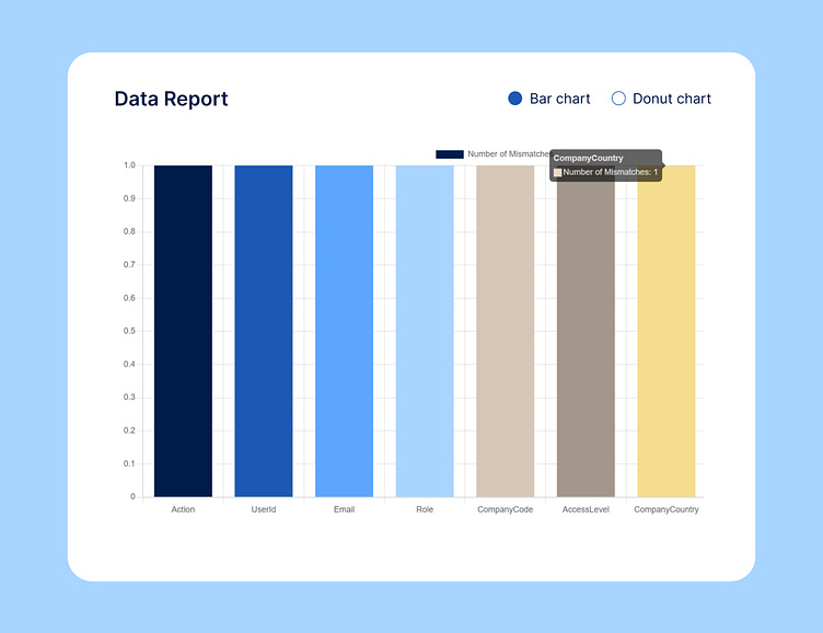
📊 Data Report with Vibrant Bar and Donut Chart Design – Insight
Presenting my latest data report UI design featuring a bar chart and donut chart in a cohesive, vibrant color scheme. This design leverages colors like deep blue (#001C4B) and bold orange (#fc542d) to enhance data visibility and provide a visually engaging analytical experience. Perfect for dashboards, business insights, and data reporting tools, this color-rich interface aids in clear, impactful data storytelling. Dive in to explore how the right colors and visualizations make data analysis more intuitive and compelling!
Suggested Keywords:
data report UI design
bar chart visualization
donut chart dashboard
data analytics interface
vibrant data visualization
business insights UI
data storytelling design
color-rich chart design
bar and donut chart combo
impactful data report design
data dashboard UI
data-driven design elements
analytical UI design
What do you think guys? Feel free to leave your feedback in the comments section. Hope you guys enjoy it. Press "L" if you like it. Thank you! 😊

