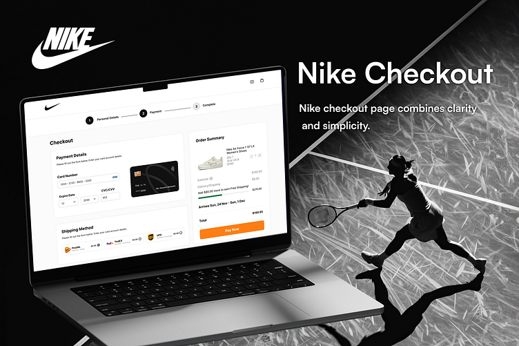
Nike Checkout Page Design 🛒👟
I’m excited to share my latest UI design for a Nike checkout page! This design aims to provide a seamless and user-friendly shopping experience. The layout focuses on clarity and simplicity, ensuring users can easily complete their purchases with minimal friction. I’ve incorporated a clean design aesthetic with clear typography and intuitive navigation elements.
Key features:
• Simple and clear layout
• Intuitive navigation
• User-friendly design
• Focus on a seamless transaction process
Your feedback is appreciated!
More by Nooshin Beheshti View profile
Like

