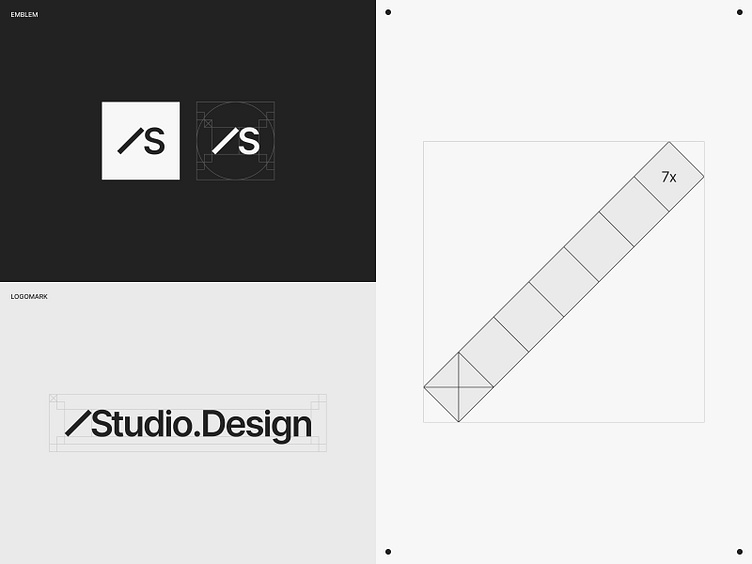
Brand Identity | Next-Gen Site Builder, Studio.Design [2/6]
Looking Back, to Move Forward
A site builder is looking to modernize their brand. Counterintuitively, they decided to look 1,300 years into ancient Japanese aesthetics for inspiration.
Reconnecting with their cultural roots helped them tell a unique story that resonates with their new international audience. Go behind the scenes to see how.
Made it this far? Give this a quick Like!
Want the full story?
---
Experience how Japanese aesthetics shape a site builder that’s faster and more intuitive for 500,000+ designers.
Try for free
Get help starting
Twitter (X) | Behance | Dribbble | Instagram | Discord | YouTube
---
Art Direction: Alvaro Arregui from Nuevo.Tokyo™ | Joe Ishii from Studio.Design
Production: Tomasz Mazurczak
Operations: Jack Park
Marketing: Kelvin Ha
More by Studio.Design View profile
Like


