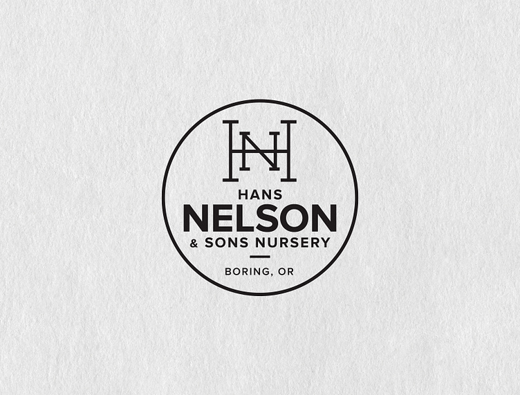
Hans Nelson Logo Before and After
Hans Nelson & Sons Nursery has been growing their family business for over 70 years. ✨
Ten years ago they came to me with their 70s-style logo and asked for a redesign. They wanted to keep the circle enclosure and the hierarchy of the type, but update it and add their location. Check, check, check!
The monogram solution is classic and versatile. Here it is in it’s abbreviated/alternate version!⚡️
More by Megan Clark View profile
Like


