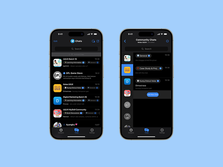
Redesigning Telegram Interface
👋 Hi Fellow Dribbbler!
✦ The Project at a Glance
A fresh take on Telegram's interface that prioritizes breathing space and clarity. Because when you're managing bootcamp communications, your messaging app shouldn't add to the cognitive load.
✦ The Challenge
While Telegram is powerful, its current interface presents some hurdles:
• Overwhelming text density
• Cramped layouts that create visual fatigue
• Inconsistent interaction patterns
• Confusing navigation for new users
✦ The Solution
Instead of just critiquing, I decided to walk the talk. Here's how we're making Telegram more intuitive:
🌟 Breathable Layout - Optimized spacing and clear information hierarchy
📱 Community Showcase - New slideshow feature for better notification management
🎯 Enhanced Interactions - Bigger, clearer picker indicators
🔔 Unified Notifications - Consistent system across all message types


