Rogers & Cowan Homepage Designs
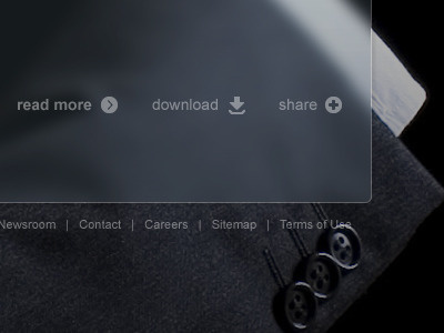
A redesign concept for Rogers & Cowan. Really liked using large background images with a "frosted glass"/ blur effect for content areas. See attachments for full view of background images with this effect.
More by Andrew Rodgers View profile
Like


