Roblox Studio Icon Redesign
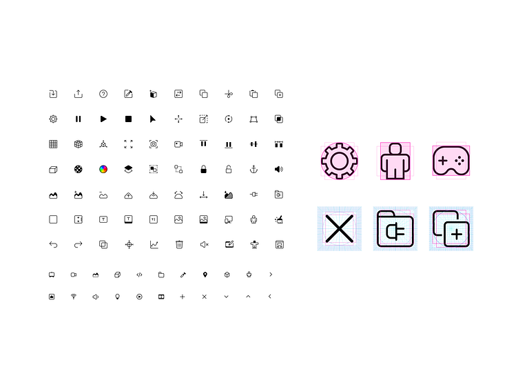
In 2020, as part of Roblox’s update of their developer studio, I created an entirely new icon system and established new standards and style guidelines for its iconography. Here are select icons from the set.
I designed the new icons with the following principles:
Clear, efficient, succinct. Communicating the information effectively is a top priority. The icons are straight forward and not abstract or overly stylized. Symbols are depicted through efficient use of lines.
Lightweight, minimal, balanced. Roblox studio is a packed workstation, the icons should not make the interface feel heavy or cluttered, but instead create ease and balance. The icons achieve this by utilizing thin strokes, minimal use of fills, and consistent grids and key shapes.
Inviting and modern. Developing a game should feel approachable and not intimidating. The icons do not feel rigid and compact—they avoid harsh edges, heavy fills, and extraneous detail and embellishment. The thin lines and the just right amount of roundness hint at playfulness while maintaining a fresh and modern feel.
