CÀ PHÊ SÂM KỲ THẢO | PACKAGING DESIGN
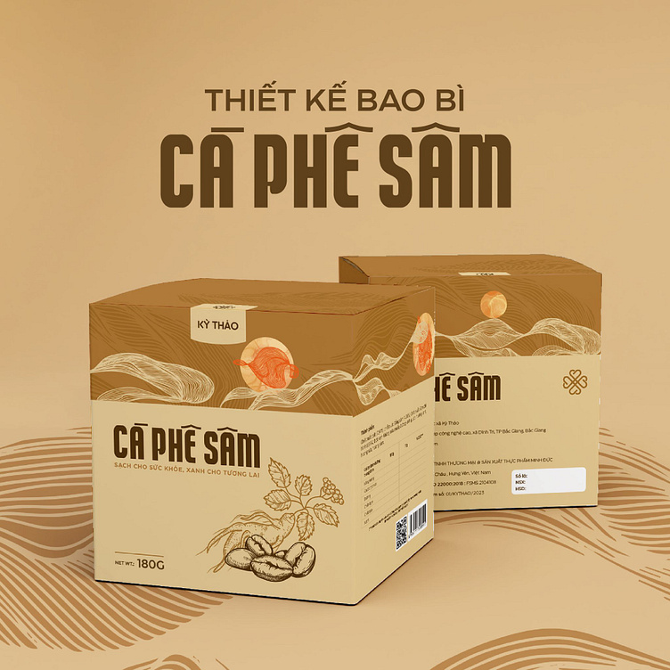
Ky Thao ginseng coffee packaging designed by Bee Art uses 2 main tones of brown and beige to bring a natural, warm and close feeling. Besides, brown is also the color symbolizing coffee beans, evoking a sense of familiarity and product quality. In addition, the product information is written in an easy-to-read font, especially the product name "Ginseng Coffee" is written clearly and prominently, helping customers easily identify the product.
The illustration of coffee beans and ginseng roots is delicately designed, emphasizing the unique combination of the two main ingredients of the product. This helps customers easily recognize and associate with the product at first sight. The image is delicately illustrated, bringing a sense of professionalism and high quality.
-
Client Kỳ Thảo
Packaging Design Project. Packaging is designed for Ginseng coffee.
Copyright© Bee Art. All Right Reserved
Contact us:
• Hotline/ Zalo: (+84) 77 34567 18
• Email: info@beeart.vn
• Website: www.beeart.vn
• Facebook: https://www.facebook.com/BeeArt.vn


