ClarityBank. Redefining the Wait
Redefining the Wait
Turn-Taking System for Clarity Bank - Innovation and Efficiency in Customer Service
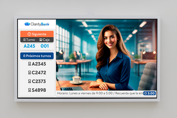
This turn-taking system was initially designed for a government project in Jalisco, Mexico. Later, it was adapted for Clarity Bank, incorporating interface elements that align with the bank’s dynamic and unconventional approach. This system aims to modernize the waiting experience, making the process clearer and more efficient for users.
### Key Design Elements:
1. Current and Upcoming Turns: The current turn is highlighted with a prominent orange “Next” button for maximum visibility, along with the counter number. Upcoming turns are listed with an hourglass icon, allowing users to intuitively anticipate their place in line.
2. Transparent Information in the Footer: The bottom of the screen includes business hours and a real-time countdown, offering transparency about the wait time and reducing users’ uncertainty.
3. Connection with the Target Audience: The background image features a young, responsible professional designed to resonate with Clarity Bank’s Latino market. This figure adds a human touch that creates an emotional connection with the end user.
4. Flexible and Functional Adaptation: The original proposal has been modified to fit a banking context, demonstrating the design's versatility and its usability in various settings.
This turn-taking system combines a modern interface and optimized user experience, aligning with Clarity Bank’s vision to offer innovative, approachable, and efficient service for its customers.
