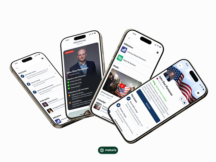
US Elections Accessibility — Candidate's Profile
Was it hard to choose your preferred candidate?
We created this US elections app specifically for the purpose of making it easy. Here’s the results page from MatchMyVote, a Tinder-like swipe mechanism that lets you swipe on agreement/disagreement on topics. The algorithm then weighs your opinions and gives you the best candidate that matches most with your preferences.
Elections should be grate, not cheesy. This is our small contribution, with software, to making the elections a more exciting thing to attend.
Check out the full design case study for US Election on Behance and tell us what you think!
What do you think? Let us know & leave a comment below 👇
——————————
Maturis is a UI/UX design lab specializing in creating future-proof products.
Get in touch with us today through maturisdesignlab@gmail.com!
Check out:
Behance for full write-ups on our case studies
Instagram for #GetUX content, where you can discover new things about UX every Friday
LinkedIn to receive company updates from us 🫡
Case Study 1: HeatCheck | Case Study 2: The Schedule | Case Study 3: Arete | Case Study 4: Pastoral

