FFNY Type Size Experiment
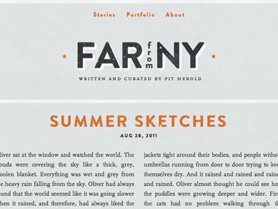
- Descreased amount of texture on type, too overwhelming before.
- Main title point size decreased, and “from” typeface changed to match “FAR” and “NY”.
- Small caps letter spacing decreased for better balance with logo and body type.