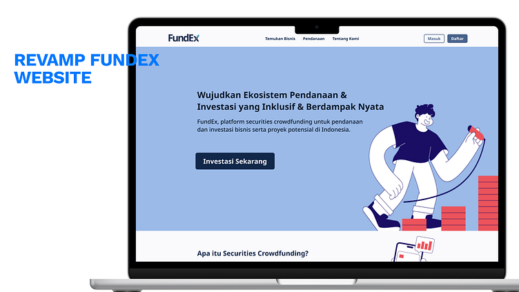
FundEx Website Revamp – Ench User Experience for Finance Growth
Hello Everyone! 👋
This is my exploration of FundEx Website Revamp – Enhanced User Experience for Financial Growth
The FundEx Website Revamp project aimed to elevate the online experience for FundEx users, focusing on an intuitive, user-centered design that aligns with the company’s mission to simplify financial growth. By reimagining the website’s structure and visuals, this revamp enhances accessibility, clarity, and engagement across all devices.
📈 The redesign process included a deep dive into user needs and feedback, which guided the development of key features: improved navigation, streamlined content presentation, and a responsive interface that adapts seamlessly on both desktop and mobile devices. Each page was optimized to increase user trust, simplify investment processes, and provide clear pathways to essential resources.
Skills Used:
🔍 UX Research, 🎨 UI/UX Design, 📐 Prototyping, 🖥️ Figma, 💻 Responsive Web Design
This project supports FundEx’s commitment to providing an approachable, trustworthy, and visually appealing platform for all investors.
Let me know what you think! 🌿👀
Feel free to check out the prototypes linked in my portfolio!🔗✨
Thank you for checking out my work! 😊
I’m always open to feedback and happy to discuss potential collaborations.
Interested in collaborating? 🤝
📧 ajib.oktober@gmail.com | Linkedin | Instagram

