QOG.co
QOG.co: A User-Centric Landing Page for Modern Grocery Shopping
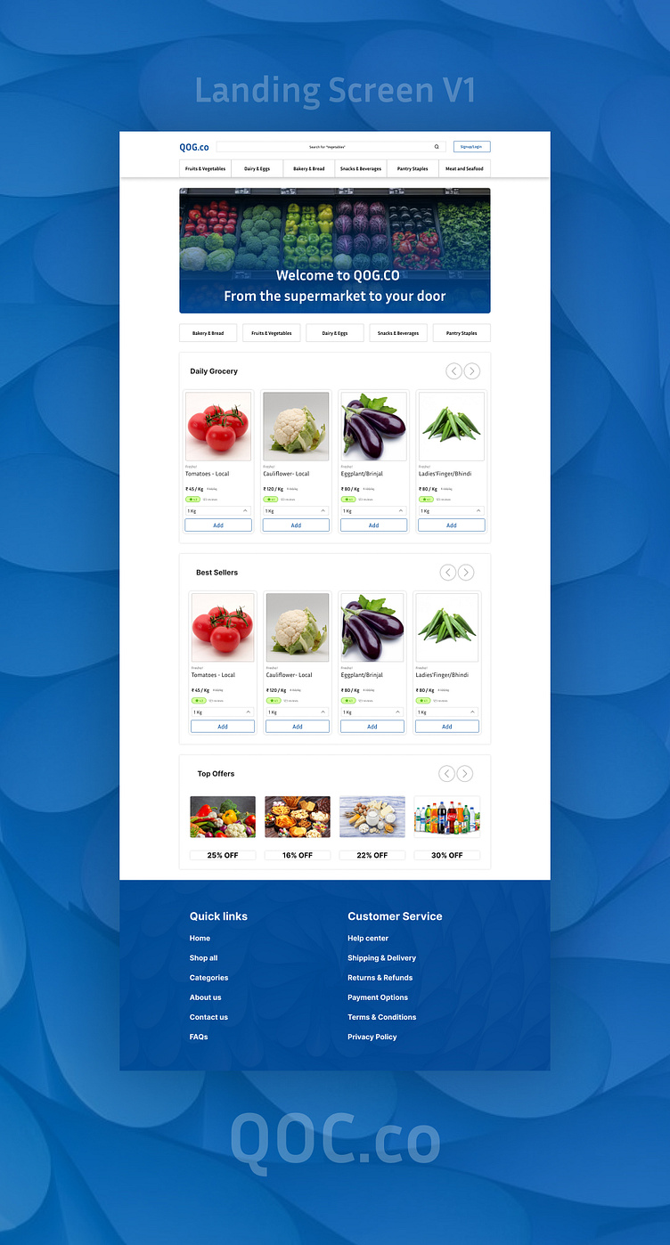
"Introducing QOG.co – a grocery store designed with ease, efficiency, and a delightful user experience in mind! This landing page was all about blending user-centric design with functional elegance to simplify the grocery shopping journey.
The goal was to create an interface that instantly feels welcoming and intuitive. I focused on clean visuals, strategic use of color to guide the eye, and a straightforward layout to make navigating the store seamless. Every design choice, from typography to button placement, was made to ensure users find what they need effortlessly, whether it’s a pantry staple or a last-minute dinner ingredient.
In developing this page, I prioritized accessibility, responsiveness, and ease of use across all devices, making sure that the QOG.co experience is smooth and enjoyable wherever users are.
Creating this landing page was a fulfilling project, allowing me to combine my passion for impactful design with a practical, real-world application. Here’s to making grocery shopping more enjoyable, one design at a time!"


