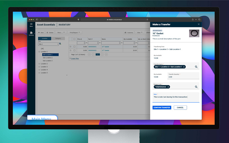
Brightly UX: Inventory Management
Highlights 🔥
✅ Inventory Manager successfully enabled customers to easily enter, move, and track assets within their ecosystem.
✅ Improved adoption of asset management features from more of Brightly’s clients led to reduced margins of error, eliminating the need manually enter this information from a clipboard.
✅ This initiative was so successful, Brightly decided against modularizing the feature, instead turning it into a flagship feature for Asset Essentials.
______________________
Overview 🧐
⏱ Time on project: 3 months
Asset management software serves a noble purpose: help companies track materials that they spend money on so they can cut down on wasted spending. As simple as this premise is, it's a lot more difficult to achieve in reality. Entities that need these resources the most are usually the least equipped to integrate and utilize them. Many businesses, organizations, and governments rely on pen-and-paper to track important data. This creates a plethora of variables that make lives much harder for entities and individuals alike.
As an asset management software company, Brightly needs to be able to properly track their clients' assets to stay competitive. Previous attempts to establish a solution were unsuccessful, with Brightly eventually scrapping the product that this functionality would live in. This left them with a bigger need than ever to find a solution that is effective and adaptable.
My design partner and I conducted research and designed simultaneously so we didn't stall out. We were able to validate ideas quickly, with new information gained from each user test helping us make informed decisions about the design. We decided on a modularized approach that could exist on top of Brightly's flagship app. This futureproofed the design in a way that allowed Brightly to reuse assets and patterns to expand the feature.
______________________
What did I do? 😎
Research
With caution to Brightly's previous unsuccessful attempts, my design partner and I ideated while we researched for a more fluid approach to the design process. Product Owners and Engineers played a major role in keeping us honest with our ideas early. Several internal stakeholders were interviewed to learn what Brightly knew about the problem to solve. Target users were also interviewed to help us understand their perception of internal inventory problems. As we gathered more information, we spent our time studying and organizing our information, which gave us confidence to move into designs.
Design
As ideas turned into solid user journeys, we began with low-fidelity interactive wireframes that we could shop to stakeholders. Our main objective during my time on the project was to ensure that our new direction was seamless and easy to use. We knew that a lot of our target users were older and less tech-savvy, so our solution needed to be streamlined enough to make them comfortable with ditching pen-and-paper for good.
Validation
As our concepts matured into interactive designs, we began reaching out to users that qualified for this interface test. We provided users with our interactive prototypes and wrote a script to help those users engage with those prototypes. We discovered quickly that our solution to make inventory accessible in a streamlined interstitial was a powerful and easy. This new direction empowered users to take action upon an asset while not losing track of their current work and minimizing repetition in their daily tasks.
______________________
Video Showcase 🎬
______________________
