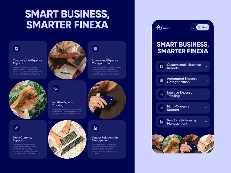
Business Page Desktop and Mobile
Optimizing for Compact and Responsive Design!
Welcome to a side-by-side comparison—Finexa's UI versus its responsive design. The responsive layout uses a vertical alignment with an accordion menu, minimizing clutter and simplifying navigation. This design choice coupled with a horizontal image alignment makes the page shorter and quicker to scroll.
Looking for a professional design agency? You can contact us to discuss your project at hi@abron.co.
More by Abron Studio View profile
Like

