Intuitive Checkout UI for Online Pharmacy Website
Streamlined Checkout for a Seamless Experience 💡
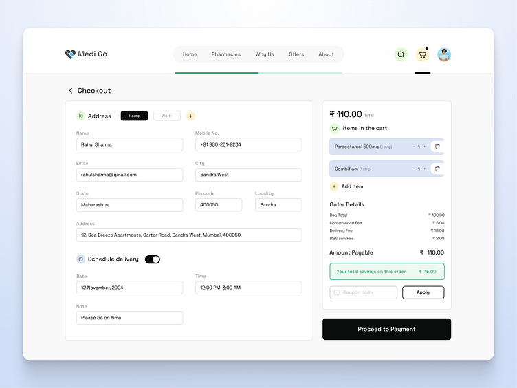
The Medi Go checkout page is all about making the final steps of ordering as smooth and intuitive as possible. Each section—from order summary to payment options—is designed with clarity and ease of use in mind, allowing users to place orders quickly and confidently.
🛒 Checkout Page UI Design for an Online Pharmacy Website 💳
Presenting the Checkout Page UI for an Online Pharmacy Website, designed with simplicity and efficiency in mind! This interface aims to streamline the payment and order process, making it quick and easy for users to finalize their medicine orders.
✨ Key Highlights:
🔍 Intuitive Layout: A clear, user-friendly layout to minimize distractions and guide users smoothly through checkout.
💰 Transparent Pricing & Order Summary: Detailed breakdown of costs for trust and clarity.
💳 Multiple Payment Options: Offering users flexibility with a range of secure payment methods.
⏰ Delivery Scheduling: Allows users to select their preferred delivery times for added convenience.
📌 For more of my work, check out my Behance and connect with me on LinkedIn to explore my experience and projects in UI/UX!

