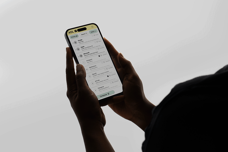
App Redesign for AOL
March 2024
Introduction
App Redesign for AOL I did in my first year of Interaction Design. We were tasked with recreating the AOL app experience in desktop and mobile, improving the way the UI communicates with the user and making it easier to understand, as at the time the AOL mail app had a lot going on, leading to cognitive overload. The current AOL map feels outdated and was also confusing for the users it was trying to appeal to, which were generally older people even though younger demographics use it in a smaller proportion too.
Mood Boards and Sketches
I gathered inspiration for the redesign, as well as started my first initial sketches of the app. I started with mood boards as well as sketches, which was very helpful as my exploratory phase in finding inspiration for what modem email applications look like, and since this was focused on desktop and mobile. I was aiming for a wide range of inspiration while relating to an email app.
Wireframes
I set out to find a balance between keeping the AOL app and website app not too busy but also leaning into a new direction with simplicity in mind. Taking what I learned from my sketches and trying new directions, I landed on these designs for the wireframes. I understood the navigation was simplified compared to the old site, and was easier to navigate.
Surface Compositions
Setting out to complete the final step of the AOL app redesign, I did surface comps. I went for the clean colors of green and yellow, drawing inspiration from soft mint and lemon palettes. I believe my redesign of the AOL app is much more user friendly and easier to navigate.
Conclusion
With my completed surface comps, I believe I improved this designs usability and aesthetics, making it more functional as well as more satisfying.


