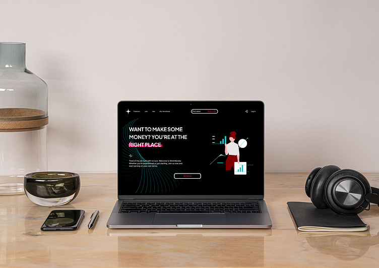
Landing Page for Freelancing Platform
The landing page for a site that connects freelancers with clients looking for top talent, allowing you to work on your terms.
WORKWANDER is the perfect freelancing site for beginners.
For this landing page, my goal was to create a fresh and inviting design that feels like a warm welcome rather than a traditional job board. Whether you're looking to hire talent or find work, I wanted users to feel at home—a place where they can pursue opportunities on their own terms, beyond the typical 9-to-5 grind.
Many elements were sourced from free assets available on Figma and other websites to match the page's aesthetic.
I chose a bold color palette and modern typography to create an energetic atmosphere. The gradient background in the testimonial section was specifically designed to draw attention.
The layout is intentionally minimal to guide users effortlessly to key actions like 'Get Started' and 'Find Talent.'


