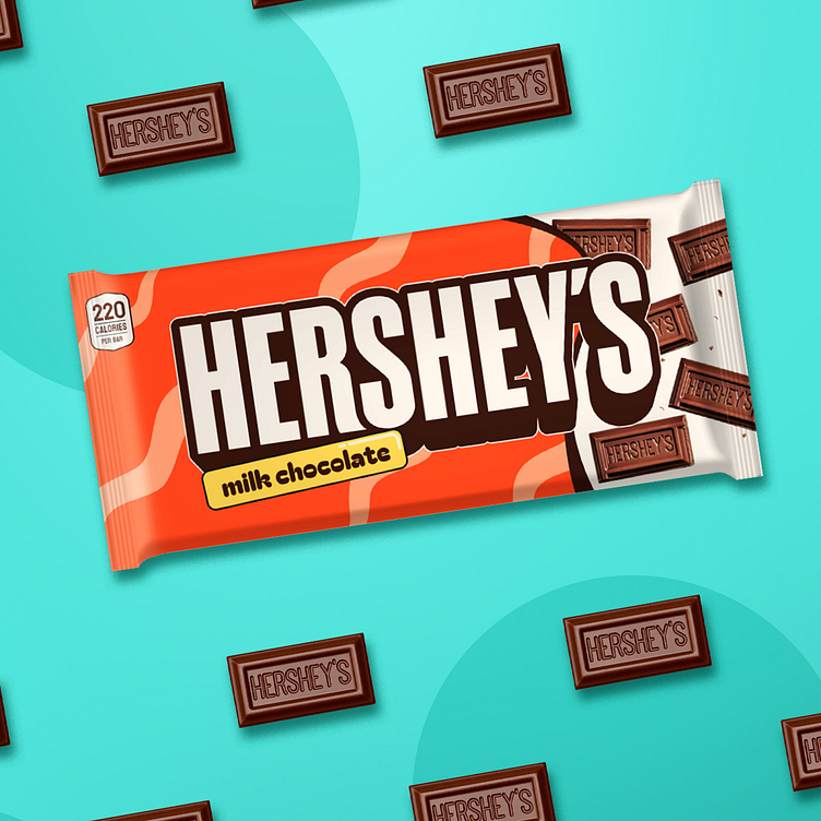
Hershey's project rebrand
We set out to help Hershey’s break through the noise in today’s crowded chocolate market, where bold, eye-catching designs have become the norm. While Hershey’s current packaging is iconic, it doesn’t fully capture the playfulness and emotional appeal that today’s consumers connect with. This project allowed us to showcase our skill in transforming a timeless brand with a fresh, engaging approach.
Our redesigned packaging brings Hershey’s to life with playful colors, dynamic shapes, and inviting textures. We added elements of surprise and joy, creating a memorable experience that draws customers in and encourages a deeper connection with the brand. Through our design, Hershey’s becomes more than just a chocolate bar; it’s now an invitation to experience joy and nostalgia.
With this vibrant, modern twist on a classic, Hershey’s is poised to stand out on the shelf and form a stronger emotional bond with its audience. This reimagined look underscores our ability to blend tradition with innovation, positioning Hershey’s for success in an increasingly competitive market.
If you like this design and want to collaborate on a project, contact us kristoph@designteam.co


