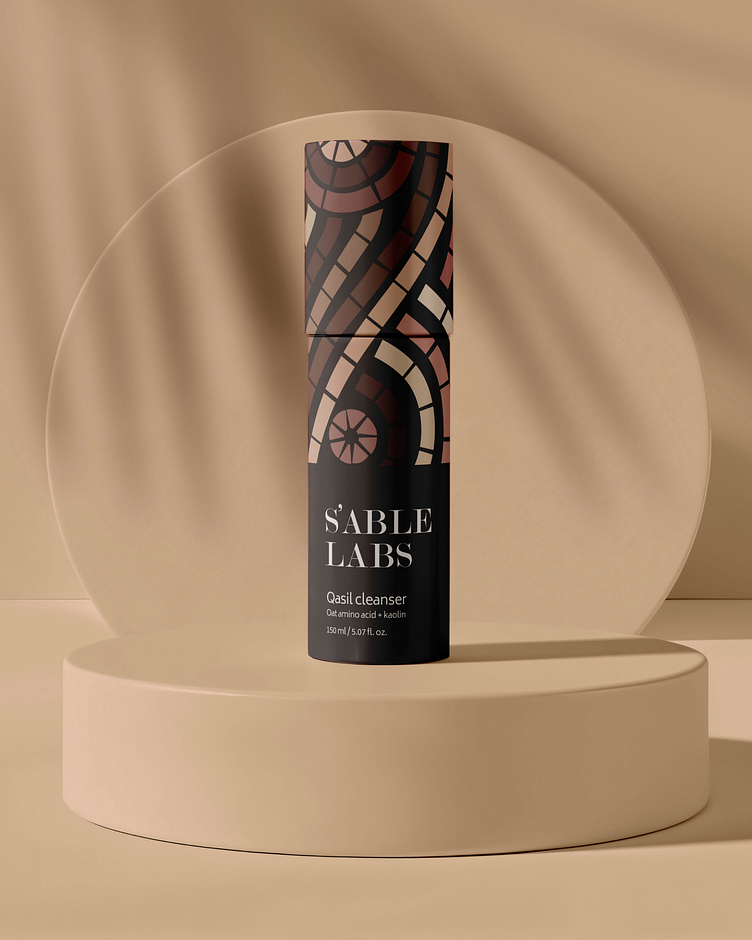
SABLE Labs project rebrand
We set out to help SABLE LABS make a bold impression in the competitive facial cleanser market, where many brands rely on sleek but often impersonal designs. While SABLE LABS’ original packaging was clean and professional, it lacked the personality, playfulness, and emotional appeal needed to connect with today’s consumers. This redesign allowed us to highlight our expertise in creating packaging that resonates on a deeper level.
Our new design brings warmth and approachability to SABLE LABS, incorporating vibrant colors, soft shapes, and fun, expressive details that convey a sense of joy and self-care. This refreshed look transforms the facial cleanser from a simple skincare product into an uplifting experience that consumers can look forward to every day.
With this lively, personality-infused packaging, SABLE LABS now stands out on the shelf, inviting customers to engage with a brand that feels both effective and enjoyable. This reimagined design reinforces our ability to make brands memorable and emotionally impactful, even in the crowded beauty aisle.


