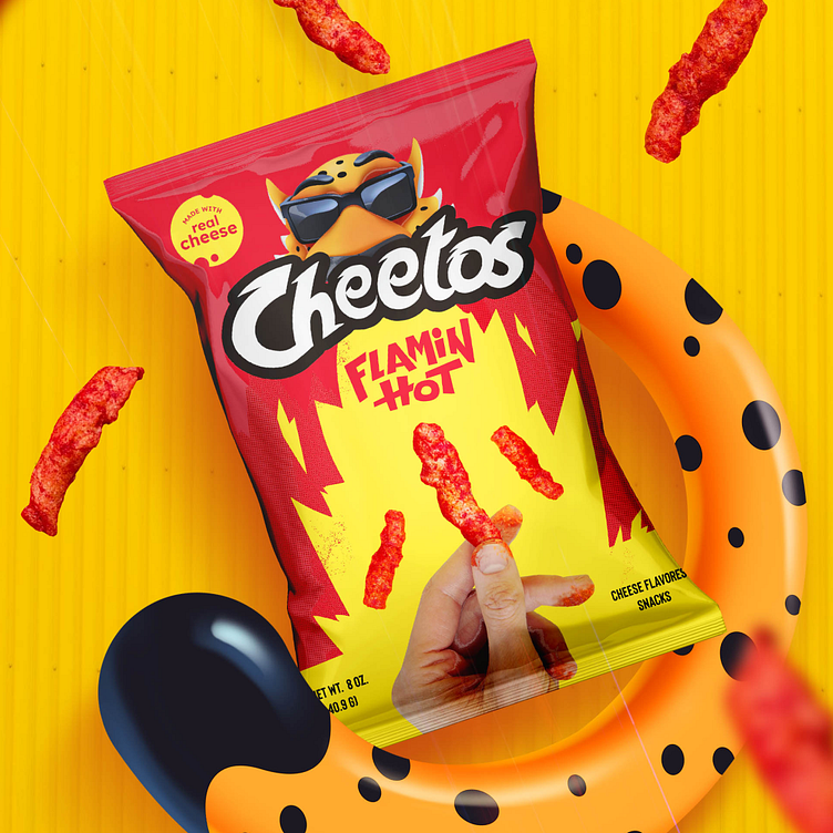
Cheetos project rebrand
We set out to make Cheetos stand out in the competitive snack market with a bold redesign. The original packaging was recognizable but didn’t fully capture the lively, fun personality that makes Cheetos unique. This project gave us the opportunity to showcase our expertise in bringing a brand’s character to life through design.
Our new packaging design channels the playful spirit of Cheetos with vibrant colors, bold typography, and organized elements that create a sense of energy and fun. By enhancing these core brand values, we’ve created a look that not only grabs attention but also forges a meaningful connection with snack lovers seeking both flavor and excitement.
With this dynamic, personality-infused packaging, Cheetos now asserts itself on the shelf, delivering an experience that goes beyond the product itself. This rebrand highlights our ability to make brands memorable and impactful, even in a crowded market, by focusing on design elements that resonate emotionally with consumers.
If you like this design and want to collaborate on a project, contact us kristoph@designteam.co


